Hello everyone!
Happy New Year to you all! I hope my first post for the year finds you all
well and off to a great start!
Happy New Year to you all! I hope my first post for the year finds you all
well and off to a great start!
My first project that I'd like to share with you is a layout using some small
photos from a photo booth shoot at the Show (it's like a big fair, here in Australia).
photos from a photo booth shoot at the Show (it's like a big fair, here in Australia).
My layout's called
"4th Shot & You Got It!"…
"4th Shot & You Got It!"…
I've focused on my youngest daughter, Heidi, for this layout - as the series of photos
tell the cute story about her first photo booth experience.
tell the cute story about her first photo booth experience.
I have used two Medium Film Strips, cut them roughly in half, painted them partially
with black acrylic paint and adhered them around the page as is. The film strips really
compliment the theme of the story in this state. :)
with black acrylic paint and adhered them around the page as is. The film strips really
compliment the theme of the story in this state. :)
I've drawn over You -Loopy Font with a yellow pearl pen - love the dimension this
gives - and I've adhered it on top of two frames; the Polaroid Frame (covered with
patterned paper) and the Loopy Love Hearts Frame (painted with pink acrylic paint
and sprinkled with iridescent glitter).
I have used the same treatment as the last mentioned frame for the Glasses from
the Glasses Set. I have also used another pair of glasses from the set as a stamp - I simply
painted the chipboard with black paint and stamped it around the page (you can see one
on the shot above next to the pink glasses and the sticker glasses… all these chipboard
pieces blend so well with the "Midway" collection by October Afternoon. :)
'
The next project I have to share for you today are these three retro-style
Valentines Day window pop-out cards…
Valentines Day window pop-out cards…
I have used three gorgeous 2Crafty pieces for each card - two on the front and one
on the inside. Firstly, for my "Match card" I have used one Juliet's Heart and an
ATC Georgian Frame (both cut in half). Both pieces have been painted and covered
lightly with glitter. The inside of Juliet's Heart has been filled with glitter and bling. :)
on the inside. Firstly, for my "Match card" I have used one Juliet's Heart and an
ATC Georgian Frame (both cut in half). Both pieces have been painted and covered
lightly with glitter. The inside of Juliet's Heart has been filled with glitter and bling. :)
Here is a slightly higher shot of the card to get an idea of how they look and stand
, and on the inside…
, and on the inside…
...peepo! I've suspended a small Chunky Heart over the window - it's been covered
with patterned paper and glitter, with the edges being fully lined with glitter using glitter glue.
I used a paper piercer to make the hole in the chipboard and tied it up using twine.
All three cards look the same on the inside. :)
with patterned paper and glitter, with the edges being fully lined with glitter using glitter glue.
I used a paper piercer to make the hole in the chipboard and tied it up using twine.
All three cards look the same on the inside. :)
My second card, is called the "Brush card"…
I've used a Heart Charm this time and two arrows from the Assorted Arrows pack.
I chose these arrows for their "cupidish" quality - goes great with the whole theme!
I chose these arrows for their "cupidish" quality - goes great with the whole theme!
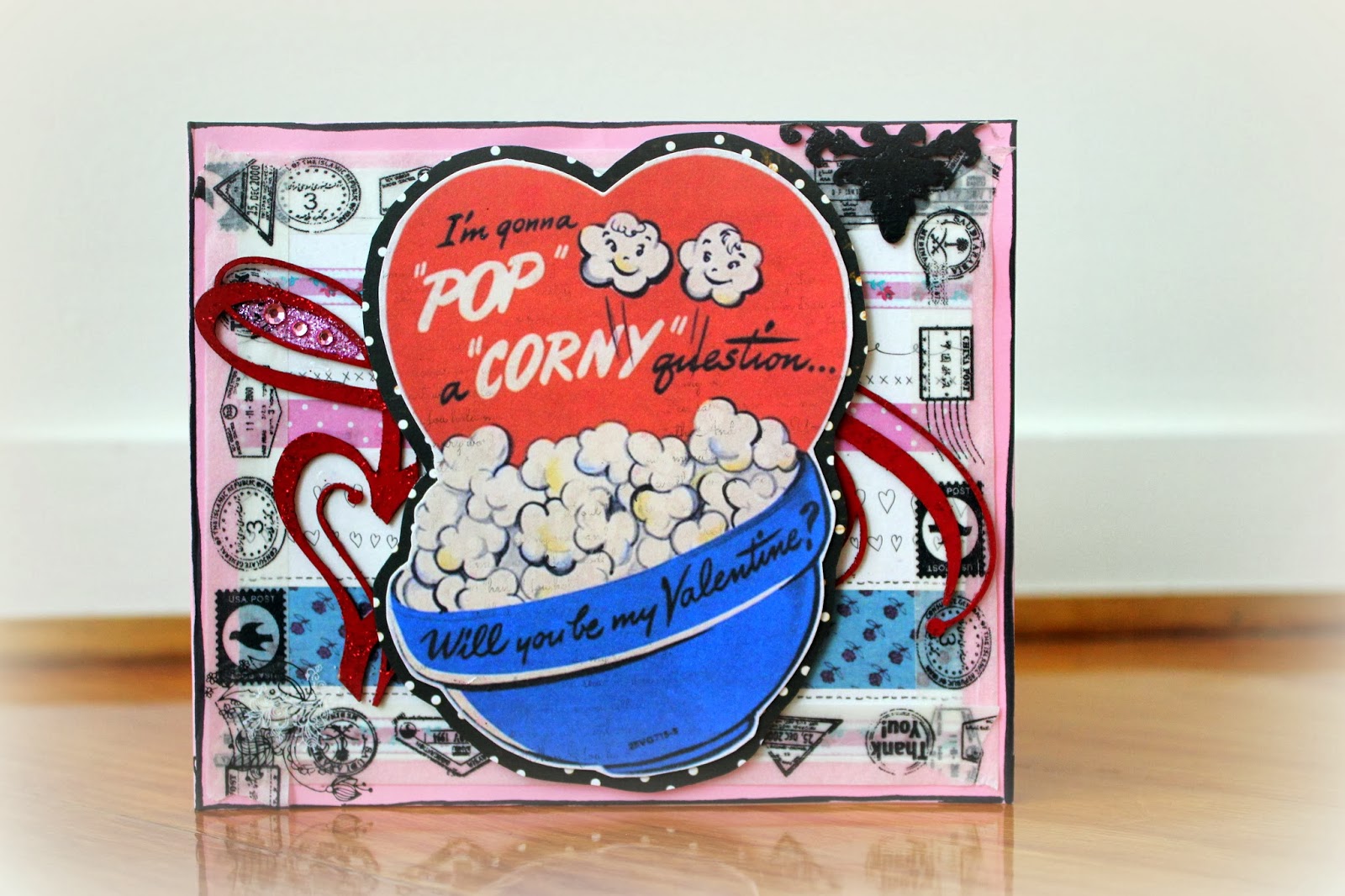
Now for my third card, the "Popcorn card"...
I have used another Heart Charm and a ATC Georgian Frame (both cut in half).
Now for my final project, a layout inspired by the current challenge over at
Scrap Around the World.
Scrap Around the World.
My layout is called
"Beautiful Inside & Out"…
I've gone for a pared-back mixed media look for this one. There are lots of layers and
mediums and each layer has been torn and pulled apart to take on a different look.
Basically it's like scrapping backwards - I don't know how else to explain it… Lol!
mediums and each layer has been torn and pulled apart to take on a different look.
Basically it's like scrapping backwards - I don't know how else to explain it… Lol!
Some of the media used; modelling paste, watercolours, ink, glitter and acrylic paint.
The title has been painted with modelling paste, swiped with watercolours, attached
to patterned paper and fussy-cut around, outlined with gel pen and attached to the layout
with foam tape.
The title has been painted with modelling paste, swiped with watercolours, attached
to patterned paper and fussy-cut around, outlined with gel pen and attached to the layout
with foam tape.
The Picket Fence has been treated the same way - minus the watercolours, and the
11" Viney Page Frame has "the works" applied to it. :)
11" Viney Page Frame has "the works" applied to it. :)
I've used two felt Mottled Moths and one Beautiful Butterfly from my store.
This is the mood board from
that provided my inspiration…
I really hope you have enjoyed my projects for this month!
Until next time, stay 2Crafty!
Cheers,
Chantal :D


