Hi everyone!
I hope my mid-year post finds you all well! This month I am so excited to
share three layouts with you featuring lots of yummy 2Crafty chipboard goodies!!!!
First up is my layout
"The Land of Make-Believe"...

I went for a dreamy, magical and whimsical look for this layout which plays on the theme of a child's imagination. Part of the journalling reads, "...and if only for a few moments, you donned a fairy costume and you entered the land of Make-Believe".
This was a really exciting layout to create! I've got lots of stunning 2Crafty chipboard designs on here and I've used the new "Dreaming in the Meadows" paper collection from Meg's Garden.
Here's a detailed list of the 2Crafty products I've used here;
1. Iron Gates - These exquisite gates have been painted black, highlighted with silver glitter (this is a fairy-infused layout after all!) and then wound the stems of rosebuds around the gates (this is really easy to do - the gate is nice and sturdy and can be manoeuvred around easily without any damage at all), I've adhered a contrasting paper underneath the gates and fussy-cut a strip of flowers and adhered them to the bottom of each gate.
2. Hearts - Inside the middle of each gate, I've adhered a small heart - they both have been covered with vintage book paper and topped with a metal heart charm. I've also "sprinkled" three more chipboard hearts to the left of my page, like confetti, plus a larger heart next to one of the top right photographs.

3. Rustic Tree - This has been painted white, and topped with glitter, pearl pen drops and rosebuds (with their stems cut off and cut in half). This is a lovely sparse tree which has been positioned behind the large silhouetted photo, between the iron gates.

4. Swirly Leaf Tree - this has been sprayed with Sprinkler Spray (by OA) and cut into lots of little pieces for greenery along the bottom and sides of the layout, and also into two large pieces - positioned at the top left and middle right. This also have been topped with glitter and pearl pen drops.
5. Gazebo - Painted in white acrylic paint with little touches of glitter, this "grounds" the top two photos and this product is a fabulous example of the exquisite quality detailing that 2Crafty has to offer.
My next layout is less dream-like but I think it makes up for this with it's funkiness!
These photos of my daughter Lucy were taken at the same occasion as the ones above of Heidi, but thanks to the wonderful world of scrapbooking, I can compliment the memory's theme and bring these photos to life!
My layout is called
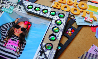
"Photo Booth Fun"
and it's based on July's sketch challenge at Life. Paper. Scrapbook...
I have used the following 2Crafty products on my layout;
1. Oversized Film Strip - This has been painted black and has been adhered on an angle in the centre of the layout. This piece provides a great focal point and every second film strip "gap" has been filled with bling for a bit of glamour! :)
2. Photo Corners - Dots - I've used two of these beauties. They have been painted white, stamped with some AC Amy Tangerine stamps using StazOn ink and distressed. For the distressing, I've simply peeled of little sections of paint to reveal the kraft-coloured inside. This is reminiscent to old sea-side photo booths, like at a carnival - which is where these photos were taken. :) Each "dot" has been pressed out and I've coloured the inside black and embedded a large pretty jewel inside.

3. Arrows - I've one large 360 degree arrow at the top right of my layout, which has been covered with stickers - which I've trimmed around the edges for a nice clean finish. I've mounted my layout title on top of velum and adhered this straight onto the arrow. The smaller arrow has been covered with patterned paper and is on the bottom left corner. I've outlined around it with paint pen for definition.

For my final layout, I am sharing the layout I made especially for 2Crafty's first ever blog hop, so if you did indeed hop along, you may remember this from my blog. :) My layout is called
"Head over Heels for Wheels!"...
... and I have used the following 2 Crafty chipboard on my layout;
1. Cars - I've used the full 8-piece pack on my layout along the two middle "roads"... one the right way up and the other topsy-turvy (to mirror my theme - "Head over Heels")!
Each piece has been painted with a black paint pen (zero dry-time) and then coated with dimensional magic once adhered to the layout. Pop on some bling rims and you're ready to roll! (This is a girly car layout after all! Lol!)
2. Tiny Film Strips - These come in a pack of two and I've used both; I've coloured them black and butted them up next to each other so they look like one long strip border. No trimming or fussing necessary! I adhered patterned paper underneath before attaching to the top of my layout...
The filmstrip not only makes a lovely decorative border but it also matches the Disney/Pixar Cars theme too. :)
3. Flourishes 1 - I've used one flourish from this fab 12x12" sheet to create a bit of smoke for the cute jeep on the bottom left corner... time for a service I think! ;) I've treated this chipboard the same way as the abovementioned cars.
4. Tabs Assorted - I've used a tiny star which was inside one of these funky tabs... it was the perfect final addition to my chipboard medley! (See top left corner.)
Well that's it for me this month! Good bye July, and I'll look forward to seeing you next month with more projects to share! :D
Cheers!
Chantal


