
Hi everyone! Welcome to the blog, happy you stopped by.
This layout is of my granddaughter from many years ago. In fact, I actually used these photos on a layout that I made when she was 5 years old back in 2009. I love to go back to older photos and give them a fresh look on a new layout. Also, over the years, my style has evolved and I have learned new techniques. So, as of late, this has been kind of my thing!
Hope you like it.
"summer fun"

summer fun
We are Cruising through life one port at a time
Ava's Frame
Circle Revolution Frame
6" Circle Revolution Frame
Elegant Flourish


3 Words...Gesso. Gesso. Gesso... that chipboard ladies!

On the upper right of the photos I tucked in the Elegant Flourish under the top of the flower cluster. I used a mixture of Crome Oxide and Neutral Gray Acrylic Paint, with a touch of Ivory Black Acrylic Paint to give it a dusty green look.

I cut the circle off of the Ava's Frame and just used the flourish part. Placing it here at the bottom of the flowers draws the eye down around the photos. This was painted the same was the Elegant Flourish.
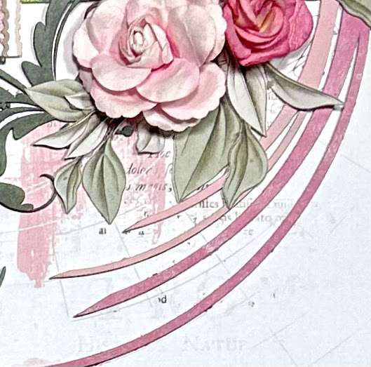
The highlight of the layout is the combination of Circle Revolution Frames. I used the large frame from the Circle Revolution Frames, along with one from the smaller 6" Circle Revolution Frames. I cut them to create a semi-circle that would sweep around the composition. I wanted them to be pink, but different shades. I painted the large one with Pink Mica Powder mixed in White Acrylic Paint, and the smaller one was painted with a mixture of White and Rose Pink Acrylic Paint. I love how these work together!

Now the title took some thinking! I often will cut the titles to only use specific words, and that's what I did here. I chose these particular words because of the photos. Since it was 'summer time' when these photos were taken, it just clicked when I was going through my titles.
I cut the word 'summer' from the summer fun title, and the word 'time' from the we are cruising through life one port at a time title, because they are the the same font and pretty much the same size. I wanted them to be a different shade of green from the Elegant Flourish and Ava's Frame, but just a little lighter. I painted them with Spring Green Mica Powder mixed in White Acrylic Paint.
I hope I have inspire you with the versatility of 2Crafty chipboard. If you can imagine it, it can be done!! See you all next time...
